The QIO Program is one of the largest federal programs dedicated to improving healthcare quality, but its go-to resource, QIOProgram.org, was no longer meeting the needs of its users.
The challenge
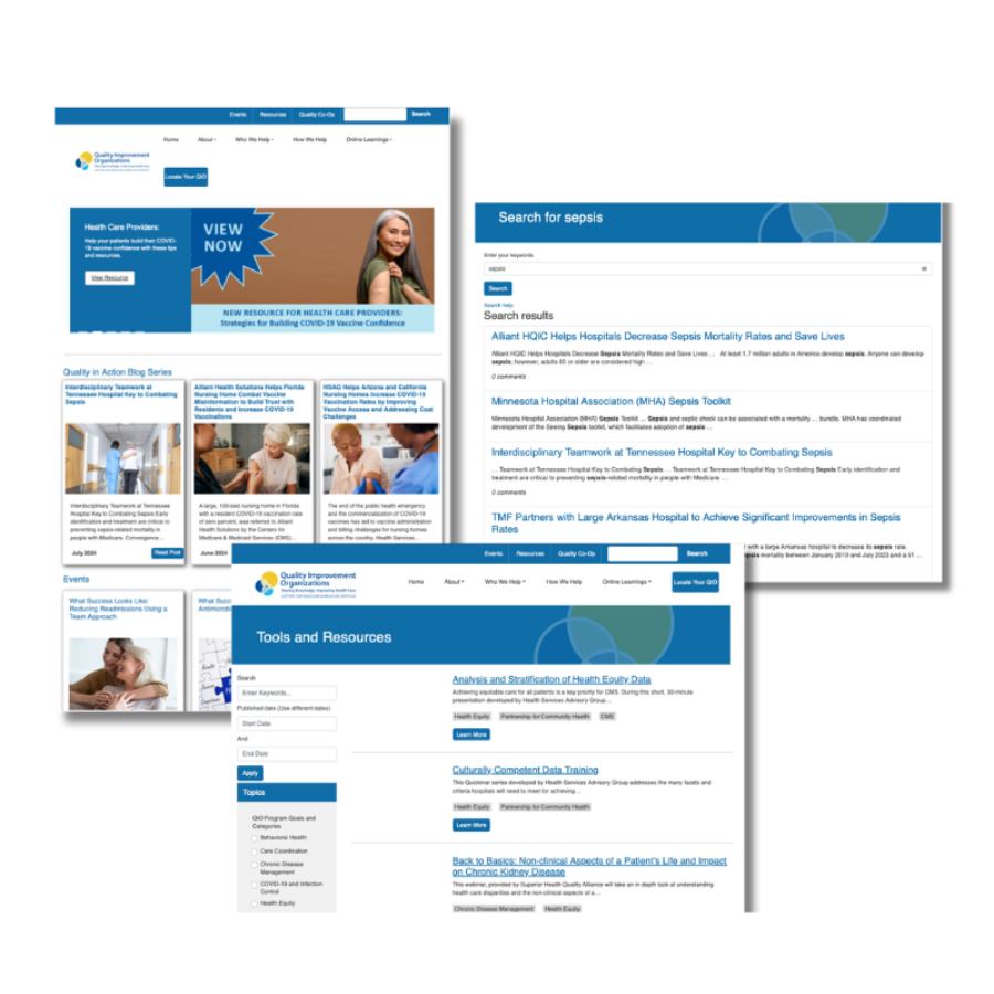
The Centers for Medicare and Medicaid Services (CMS) Quality Improvement Organization (QIO) Program — one of the largest federal programs dedicated to improving care at the community level — needed its website to work harder. QIOProgram.org is the go-to hub for quality improvement training, events, resources, and best-practice articles. But the site had an outdated look, limited search functionality, and a members-only area (Quality Co-Op) that offered little value beyond a profile photo and membership length.
Our approach
Working with Bizzell US, the contractor managing QIOProgram.org, we implemented a three-pronged approach to improve the overall look and feel, enhance the user experience and better engage members of the site's members-only area.
We started where we always start: with the audience. Our team developed user personas to capture the real needs of three distinct user groups:
- Busy QIO staff searching for specific resources
- Healthcare providers often accessing the site on mobile; and
- Program administrators managing content and tracking engagement.
Those personas shaped every decision that followed.
From there, we worked with Bizzell's IT team to assess the content management system, ultimately recommending a Drupal upgrade over a full platform migration to stay on schedule and on budget. We then:
- Led a comprehensive audit of more than 3,000 pages, resources, and files removing anything outdated, redundant, or irrelevant
- Modernized Quality Co-Op by evaluating community platforms against our user research and selecting one that strongly matched what members needed: topic forums, customizable notifications, rich profiles, and content filtering.
- Conducted hands-on user testing of the registration flow, resource library, and mobile experience
We also developed a comprehensive communications plan to drive adoption that included live site demonstrations, a targeted email campaign, how-to videos, and fact sheets walking new members through registration, profile setup, and content preferences.
“[The new site is] amazing...visually appealing and the navigation is nearly flawless.”
The results
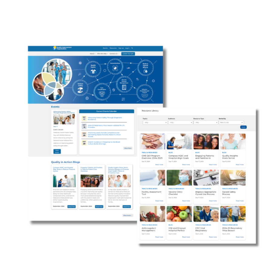
The refreshed site launched on August 1, 2024 — on time and exceeding every objective:
- 75% reduction in site content
- 103% increase in website views
- 227% increase in new users
- 380+ Quality Co-Op sign-ups in the first month
August 2024 alone delivered 62,000 site views — the highest monthly total since Bizzell began managing the site in 2019.
What made this work
Grounding every decision in user research meant we weren't redesigning for aesthetics alone — we were solving real problems for real people. By combining strategic communications planning with hands-on user testing and a clear adoption strategy, we turned a federal website refresh into a meaningful improvement in how a critical healthcare program serves its community.